Our brand has one audience: us
One Totem was designed for the people who have to live inside it, not for clients. What that decision changed, starting with the logo.
For years, whenever we had to explain our different brands and business model, we used to say we were "an agency with many faces".
The velocity of change that started in 2020 called for a different approach. As our team grew and evolved, it became more diverse in nature and skillset. Every new teammate remapped the adjacent possible of our company.
Individually, we're a strange blend of very different backgrounds, nationalities, cultures and skills. A rare breed of experts, leaders, poets, rebels and geeks, working remotely four days a week and ditching rule books as we go.
We found ourselves in need of a brand that was able to convey that. We needed a story to tell ourselves.
Who is it for?
That's the first and only question in branding, and the one most often overlooked.
From day one, we decided the new brand would have only one audience that mattered: us. It had to be conceived from the ground up as a narrative that united us across time zones, skillsets, experience levels, career paths and personalities. Its sole purpose is to nurture a feeling of ownership over everything we do and uniqueness over how our daily work helps us shape ourselves, as we shape the organization in return.
That is when the concept of a totem came into play. A totem, in the collective imagination, is a collection of avatars creating a whole stronger than the sum of its parts. It's a symbol of what we are, or want to be.
As we drafted ideas, this unfolded pretty easily:
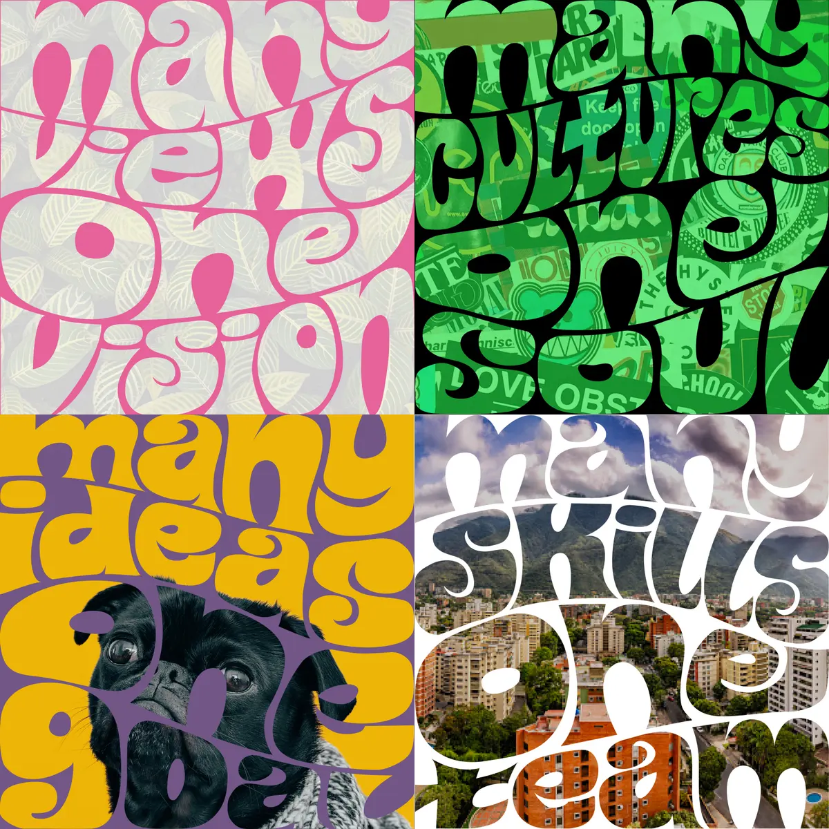
Many views. Many ideas. Many skills. Many cultures. One team. One Totem.
Simple on purpose

Our logo is a simple shape. Design-wise, it's just a square shaped by two number ones, or a split T. As branding narrative elements, these clean lines represent more to us:
- A window to peek into our ways.
- A door to unexpected adventures.
- A mirror to identify, and to foresee.
Many views, many cultures
We create an environment where being opinionated is the norm, where we all speak our minds and pick our fights, and where freedom comes through accountability.
Our brand is a reflection of that. The symbol, the totem, the avatar, is nothing more than an excuse to introduce ourselves to the world.
Our logo is customized for each team member. We all get to pick a visual that represents us or is important to us in some way. Thus, the logo becomes nothing but a canvas, a Sawabona that reflects our singularities as it introduces us to the world.
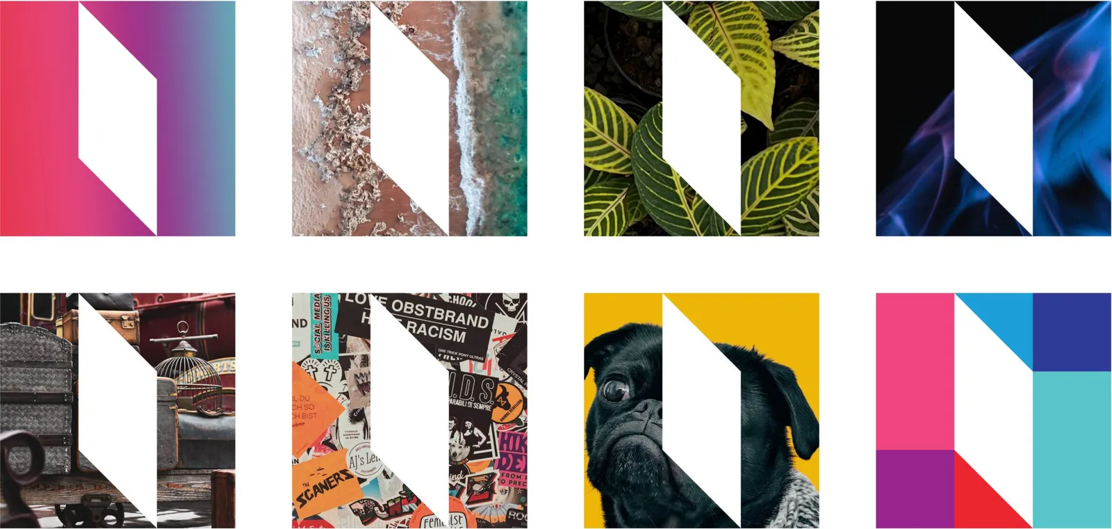
Many ideas, many skills
We created a set of core mottos to complement the logos. These ideas take shape in different lettering styles.
We get to pick textures, styles, colors and wording, which results in a fully customized experience of what the brand is for each of us, a framework that allows us to choose how we connect to the overarching narrative.
Message becomes design. Design becomes expression.
The stories we tell ourselves
One Totem was built to work as the anchor, the constant of our team.
As a fully remote company, our brand is our office, our common house, the true story at the heart of our operation. And home is where the heart is.
Everything we do in the future — and we have great expectations — is rooted in who we are, individually + collectively.
Welcome to One Totem, our House of Ideas.
First published on onetotem.com in May 2022 as "The Brand", the page that lived at /brand until this site replaced it. The images are the originals.